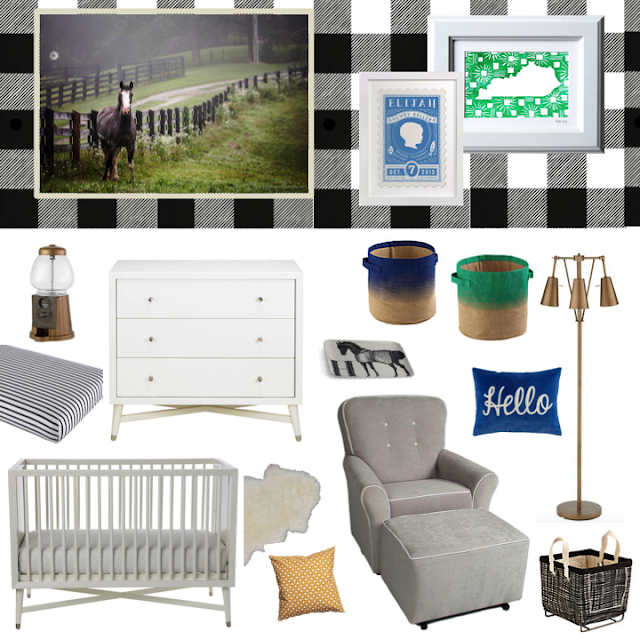
You might remember when I first put together the concept for Baby P.'s nursery. It was right around this time last year. My goal was to give our Bluegrass baby a southern gentleman-inspired room, outfitted in black, white, Kentucky blue and kelly green.
My original vision included a feature wall of a black and white gingham pattern behind the crib. Well it turns out the wallpaper I loved was coming from another country. It took so long just to receive the sample strip I ordered. Then, financially it didn't make sense. It was going to end up being crazy expensive and take forever to arrive, so I tweaked my plan.
As a reminder, here's the originally concept:
Here's a recap of what actually came to fruition from this plan:
Gingham peel and stick removable wallpaper (decided to pass)
Horse canvas from Brookside Photography (repurposed different horse canvas from my living room)
Custom silhouette print from Minted (purchased) | Kentucky print (purchased)
Gum ball machine nightlight (didn't end up purchasing, although I still love it)
Striped crib sheet (purchased) | Dwell Studio dresser (purchased) |
Gold floor lamp (Went with a Target one instead) | Dwell Studio crib (purchased)
Sheepskin (Repurposed different from living room) | Gold pillow (decided to pass)
Glider and ottoman (purchased) | Black and white storage bin (purchased)
The most visually appealing rooms are 1) collected over time and 2) evolve due to trial and error. Sometimes you don't know how the scale of all the pieces are going to come together until you straight up style them in the space. I promise you there will be points where you have to buy things and then return what doesn't work. It is truly a refine as you go process.
So what does Baby P.'s space look like today? Here's a sneak peak:
I'll have to photograph a full tour soon.
In this photo, you probably only recognize the glider, sheep skin, crib and lamp look-alike. All of the other items were either gifts (the tent, toy horse, cloud/star mobile and birch trees), last-minute splurges (the Pottery Barn window shade) or items reused from other rooms (the horse pillow).
While my dream gingham wall didn't come to life, I was able to create some interest. My husband and father-in-law installed trim in a higher-than-normal position. We used Mindful Gray from Sherwin-Williams on the bottom and topped the space off with bright white.
I'm pleased with how the space came together. Although, it did take months. I was still adding finishing touches even after our baby boy arrived, but that's okay.
So, what do you think? Are you an evolve-as-you-go type of decorator?


How did you like your Dwell Studio crib? Has it held up well? I've got my eye on it!
ReplyDeleteSo far, so good! It actually matches the Dwell Studio dresser we bought at Bargains and Buyouts. It did take three months to arrive though.
DeleteOne lucky baby boy! I love how you adapt to what happens and don't get hung up on something that is unattainable.
ReplyDeleteKathy Smith